Team Behind the Design
Logo Design Analysis
_5c786a0bf588-desktop.jpg?rmode=max&width=665&height=403)
When reviewing abstract logos, I examine symbolism, typography, scalability, and brand fit.
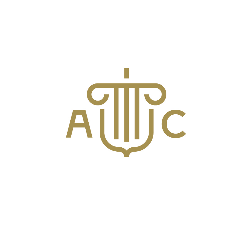
Cubby Studio’s design for Acorn Consulting checks all the right boxes.
- Concept: The abstract emblem references classical forms that evoke tradition, law, and stability, which are qualities essential in consulting.
- Typography: A clean sans-serif provides modern contrast, ensuring the identity feels current without losing gravitas.
- Scalability: The logo functions effectively across applications, from full lockups to the monogram version seen in initials.
- Application: The mark adapts well to different backgrounds and contexts, preserving clarity in both digital and print uses.
_1e3e6edddbea-desktop.jpg?rmode=max&width=668&height=405)
What Brands & Agencies Can Learn from Acorn Consulting
This abstract logo shows how to balance traditional symbolism with modern execution to create a timeless identity.
1. Evoke a Feeling
You can use an abstract symbol to communicate a mood without being completely literal. A mark that references classical architectural forms, for example, helps establish a tone of stability.
2. Balance Old and New
Pairing a traditional-style icon with a clean, modern typeface creates a balanced identity that feels timeless.
3. Create a Logo System
A modern identity needs to be flexible. You should design multiple versions of your logo to fit different spaces. For instance, have a simplified monogram for small applications like social media profiles.
About DesignRush Featured Designs
At DesignRush, we highlight standout projects every month. Logos like Acorn Consulting’s are recognized for their ability to balance symbolism with modern execution.
Many go on to become Monthy Design Award winners, amplifying their visibility in the industry.


